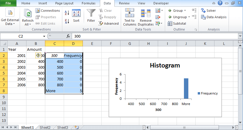
An Excel histogram is a bar chart that organizes data points in the user-specified ranges. Here we have provided the steps to create the histogram in excel for both Windows and Mac devices. Check the steps properly and follow every step to create histogram online.
Table of Contents
Histogram in Excel
A histogram chart is the column excel charts which are used to show the data frequency. To draw histogram you require two different types of data one is the data to analyze and the other one is bin numbers that represent intervals. The output of the histogram in excel is displayed on the same worksheet that shows a histogram table along with a column chart reflecting the data in the histogram table.
Histogram in Excel 2016
If you are using Windows 2016 or 17, then you can follow these steps:
- Take dataset.
- Go to the insert tab.
- Choose statistics chart.
- Go to the charts option and look for the “histogram” chart icon.
- Click on this icon and you will get a histogram graph.
If you want to make customization then right-click on the graph and choose Format Axis. In Axis option, you will find various things. Choose according to your wish.
Histogram in Excel 2013/2010/2007
If you want to create a histogram in Excel 2010, 2013 then you need to follow these steps:
- To create excel histogram you need to use Add-Ins.
- Go to the developer tab.
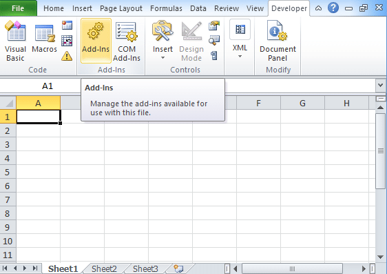
- In the excel developer tab, you will find add-ins.
- For histogram in windows, you must have analysis toolpak in your excel.
- In Add-Ins option, you will find analysis toolpak option.
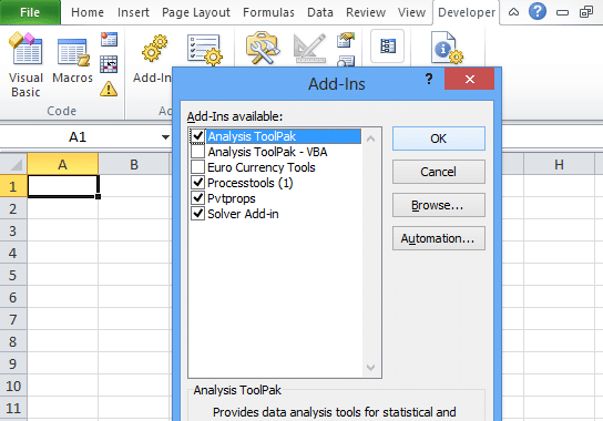
- Click Ok.
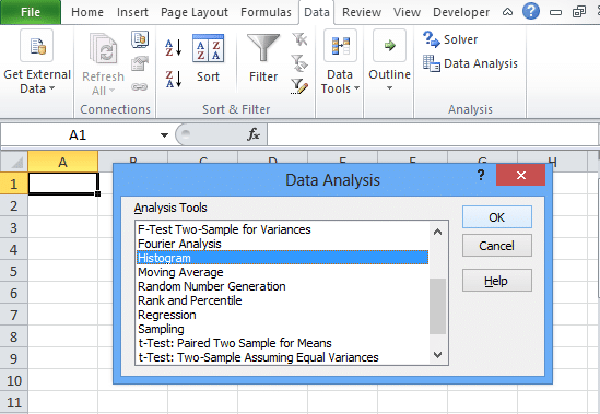
- Go to the data tab and then choose the data analysis option.
- In your worksheet, you need to type your data into one column.
- In the second column, enter bin numbers in an ascending form. If you do not enter the bin numbers then the tool will take evenly distributed bin intervals automatically using its maximum and minimum values as the start and endpoints.
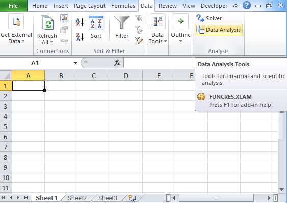
- Click on histogram option and then Ok.
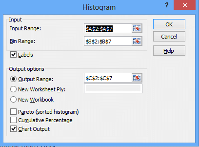
- In Input range, enter the cell reference having input numbers whereas in excel histogram bin range enters the cell reference having bin numbers.
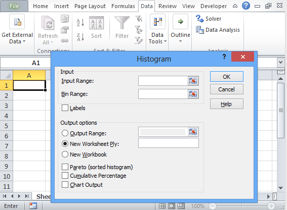
- If you want to add column labels then select labels box.
- In the output section, enter the output location.
- After this, you need to select any of the options like Pareto that shows data in descending order, the cumulative percentage that adds cumulative percentage line and chart output for embedded histogram chart.
- After completion of this task click Ok.
For example, above you can see the data set wherein one column you find year option and in another column, you find amount option. By following the above process you will find a histogram graph shown above.
How to Make a Histogram in Excel Mac?
To create a histogram in mac, you need to follow these steps:
- Create a data list.
- In the ribbon, go to the insert tab.
- Click on statistical icon graph.
- Choose histogram and select the histogram graph of your own choice.
- In this histogram, you will find the chart design option by which you can customize the look of your chart. If you are unable to see the chart design then you can click anywhere in the histogram graph and add the design format to your ribbon.
Last Words
If you are using Windows, then histogram in excel 2016 version, you will find in-built histogram chart similarly like mac devices. If you have excel version 2013, 2010, or lower version then to create a histogram, you need to use data analysis toolpack option or use frequency function.

