

 1")
If you are hotelier or you have any other business then this excel chart is very useful for you. For hotelier, grocery shop owner, tiffin center, take away service provider, the excel charts can help you to double your business. You might be wondering how it can help you grow your business. Take a look at its insight and know how to create Pareto Chart.
Table of Contents
Pareto Chart
Pareto chart is based on the Pareto principle which is a part of project management which is used to prioritize your work. The Pareto chart is also known as Pareto Distribution Diagram or a sorted histogram in excel.
This is a vertical bar graph where the values are denoted in the descending order of relative frequency. With this chart, you can analyze the problems that in your organization has as per your customer views. There are two types of Pareto Charts; one is simple or static Pareto Chart another is Dynamic or Interactive Pareto Chart.
Pareto Principle
According to this principle, 80% of the problems come from 20% of the causes. You can also call Pareto principle as 80/20 rule. The chart denotes that 80% of your output is because 20% of the input given. The taller the bar, the more you have to focus on its changes as it has the highest cumulative effect in your business.
With this graph, you can depict which factor is causing a great impact and will be going to yield amazing benefits. This is one of the best tools for quality control. In this graph, the independent variables are listed on the horizontal axis whereas the dependent variables are listed in the bar height. A point-to-point graph is superimposed on the bar graph.
Pareto Chart Example (Way to increase your business)
With Pareto chart, you can analyze the issues that the business is facing and on which issues you need to pay attention. Let’s take an example of a clothing store, with time the growth and profit of this store are declining day by day. The manager of the company did not perform any customer survey and assumed that the decline is because of customer dissatisfaction. Because of that, he blamed his supply chain management and marketing department.
This strategy did not work so he then plotted Pareto chart by doing a customer survey. By doing so, he found that the problem is not because of supply chain management. The outcome of the problem comes with the Pareto chart is the rude behaviour of salesperson, parking problem, poor lighting system. When the manager started focussing on these issues his business started growing day by day. This is how you can use in your business to grow it double.
How to make Pareto Chart?
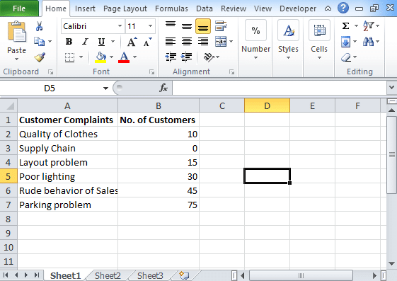
- After performing a survey, list the data in data set. Here we are taking an example of the same Clothing store.
- In column A, we are listing problems faced by the customers whereas, in column B, we have listed the total number of customers who are facing these problems.
- Go to the Insert icon and then Statistic Chart option.
 2")
- If you are unable to find it then you need to add this function using Add-Ins.
- To add this function, go to the excel developer tab option.
- Choose Add-Ins option and click on it.
- You will find a pop-up where you need to select an options analysis toolpak.
 3")
- Click on OK.
- Go to the data tab.
- You will find data analysis option.
 4")
- Click on it and it will show you a pop-up.
- Choose histogram and then Ok.
 5")
- In data analysis pop-up, you will find Pareto chart option. Choose the option and get the chart.
- If you have statistic option, then go to the histogram and then select Pareto chart.
How to create Pareto Chart in Excel?
- Take dataset.
- Calculate the cumulative percentage using the simple formula
=SUM($B$2:B2)/SUM($B$2:$B$7)
- Using this formula, you can calculate the cumulative percentage.
 6")
- Choose the dataset and select from A1 to C7.
- Go to the Insert icon, then charts.
- In charts, select a 2D column and then clustered column.
- With this you will get a column chart with 2 series of data, one is no. of customers who complaints and another is the cumulative percentage.
 7")
- Now right click on the chart or any bar and click on Change Series Chart Type.
 8")
- After clicking on this icon you will find a change chart type box, and on the left side, you will find various options from where you need to choose Combo.
- This way you will get your chart.