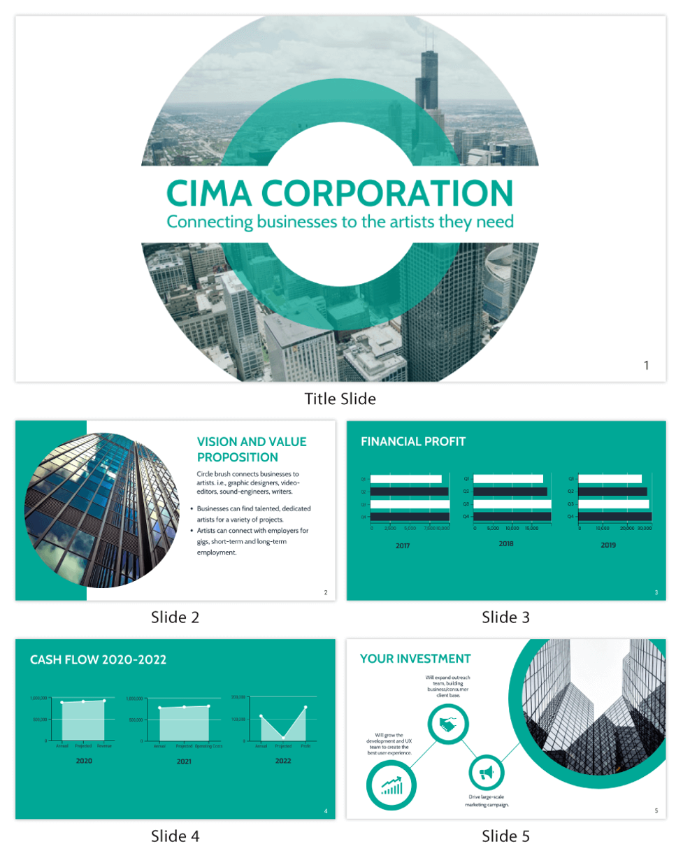
There is a lot that goes into writing an effective sales deck. You have to think about the type of person who will be reading it, what they want and need and how carefully crafted copy can influence your read. This leaves little to no time for thinking about images. However, choosing the right design can make or break your sales deck template.
Table of Contents
1. Keep It Consistent
When deciding on the look of your sales pitch deck, you’ll want to strike a consistent tone between aesthetics and content. The last thing you want is for your reader to become lost in an ill-matched set of colors and shapes. There are plenty of ways you could straddle this line, but here are some ideas to consider:
Clean and simple is always a go-to. Minimalism can help highlight your value propositions to your reader without distraction. Adding too much detail or verbiage to an otherwise sparse presentation can lead the reader to become lost in sentences, rather than understand what you are trying to say.
A unified color palette can also help keep your reader from becoming lost in visual noise, as mentioned above. It can be as simple as using a single hue throughout, or as complex as layering different colors over one another to create an engaging and eye-catching presentation. Just make sure to pick something easy on the eyes.
Lastly, the use of shapes and lines can help to draw the eye and bring focus to your content. For example, blocks of text that line up with the edge of a slide typically work better than those which don’t.
2. Know Your Audience
It’s generally understood that visual elements play an important role in catching the eye and stimulating interest, but considering who your audience is can help you determine what works best. For example, if you are pitching to a group of young tech-savvy millennials, it might make sense to use imagery that plays off their interests or culture. This could be as simple as using the right colors, iconic figures/brands, or relevant designs. Just remember that this shouldn’t be at the expense of clarity. An image can still represent something without being too literal about it.

3. Make It Personal
You also might want to consider personalizing your sales deck design for the person reading it. This can go a long way toward building rapport and understanding what’s important to them. This can be done through the use of imagery, text, an infographic, or even the language used. It’s about building that connection to your deck and brand so that it feels like they are receiving something unique and tailored just for them, so always aim to treat your deck like it’s just for that one person.
If you’re looking for a way to make your sales deck professional and personal, you can try out Venngage.
4. Keep it Short and Sweet
While images are important, you don’t want them to be the only thing your reader is looking at. Not only could this make things confusing, but you’ll run the risk of not getting across everything you need to say in the time allotted.
5. Consider Length Opportunities
Some presentations are longer, which makes it harder to decide on the best time to use an image or not. As a rule of thumb, try to stick to using images only every 3-4 slides for a fifteen-minute presentation and about once per slide for a thirty-minute meeting. Anything more can slow down the pace of your presentation and risk losing your audience’s attention.

