If you are hotelier or you have any other business then this excel chart is very useful for you. For hotelier, grocery shop owner, tiffin center, take away service provider, the excel charts can help you to double your business. You might be wondering how it can help you grow your business. Take a look at its insight and know how to create Pareto Chart.
Table of Contents
Pareto chart is based on the Pareto principle which is a part of project management which is used to prioritize your work. The Pareto chart is also known as Pareto Distribution Diagram or a sorted histogram in excel.
This is a vertical bar graph where the values are denoted in the descending order of relative frequency. With this chart, you can analyze the problems that in your organization has as per your customer views. There are two types of Pareto Charts; one is simple or static Pareto Chart another is Dynamic or Interactive Pareto Chart.
According to this principle, 80% of the problems come from 20% of the causes. You can also call Pareto principle as 80/20 rule. The chart denotes that 80% of your output is because 20% of the input given. The taller the bar, the more you have to focus on its changes as it has the highest cumulative effect in your business.
With this graph, you can depict which factor is causing a great impact and will be going to yield amazing benefits. This is one of the best tools for quality control. In this graph, the independent variables are listed on the horizontal axis whereas the dependent variables are listed in the bar height. A point-to-point graph is superimposed on the bar graph.
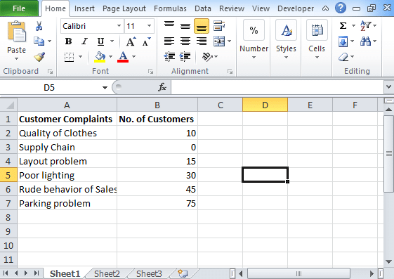
With Pareto chart, you can analyze the issues that the business is facing and on which issues you need to pay attention. Let’s take an example of a clothing store, with time the growth and profit of this store are declining day by day. The manager of the company did not perform any customer survey and assumed that the decline is because of customer dissatisfaction. Because of that, he blamed his supply chain management and marketing department.
This strategy did not work so he then plotted Pareto chart by doing a customer survey. By doing so, he found that the problem is not because of supply chain management. The outcome of the problem comes with the Pareto chart is the rude behaviour of salesperson, parking problem, poor lighting system. When the manager started focussing on these issues his business started growing day by day. This is how you can use in your business to grow it double.
=SUM($B$2:B2)/SUM($B$2:$B$7)
NGINX Server Nginx, a popular open-source web server, excels at handling high traffic websites efficiently.… Read More
In the realm of web hosting, choosing the right web server is paramount. It acts… Read More
Are indispensable for ensuring smooth, precise linear motion in many industrial applications. Whether in robotics,… Read More
Cyber attacks are becoming more frequent, complex, and damaging. They can disrupt critical operations and… Read More
With the rise of new threats and the increasing complexity of IT environments, organizations need… Read More
1. Introduction In software design, managing complex systems can be challenging. The Facade Design Pattern… Read More